Before I start, I want to mention that there is a standard way to build your own visualization plugins in Apache Superset, and the links below will suffice;
🌐 Links
https://superset.apache.org/docs/contributing/creating-viz-plugins/
https://preset.io/blog/building-custom-viz-plugins-in-superset-v2/
Read also: How to setup and embed Superset into your React App https://www.tetranyde.com/blog/embedding-superset

Get Apache Superset Up and Running
Lets use docker as it’s the easiest and quickest way to get started. Clone the repository:
git clone https://github.com/apache/superset.gitNow run the following commands (navigate into the cloned superset directory). Make sure it’s the docker-compose.yml file instead of the non-dev one.
cd superset
docker-compose up -d
It will take some time for Apache Superset to be up and running at localhost:8088.
Creating a New Plugin
Lets make a copy of the table-chart-plugin, instead of directly editing the original plugin. Edit the name of the plugin as “customized-table-chart-plugin” or give it whatever name you desire.
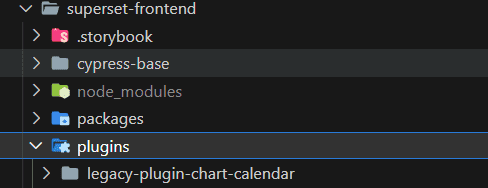
Navigate to the plugins folder inside the superset-frontend folder and copy the plugin-chart-table folder and rename it.
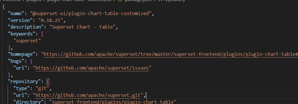
Lets edit the package.json name and you can change the rest such as description etc if you want but I am going to leave it as it is so we can focus on the code logic.
Let’s change the plugin name as well. Go to the index.ts file inside the plugin-chart-table-customized/src folder and edit the name property as follows:
name: t('Customized Table')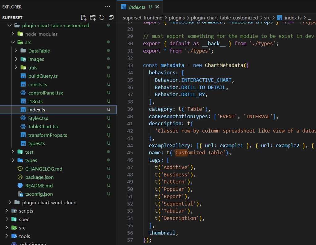
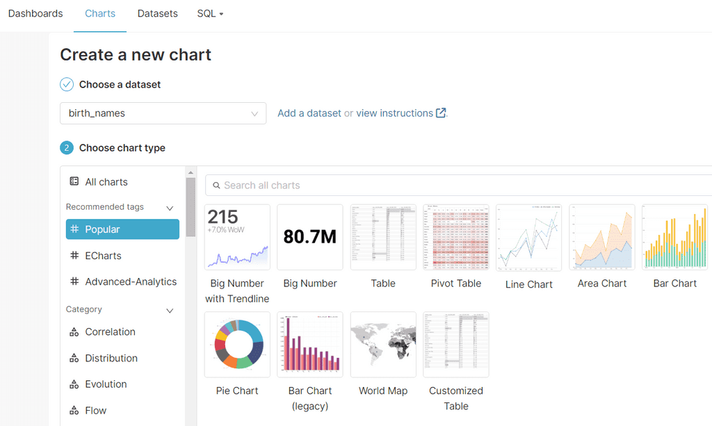
You can edit the description and change the thumbnail if you like. With what we have done so far when we load the charts list from Superset create chart window we will be able to see our plugin under the name ‘Customized Table’ in the tag options we have listed here.
Now we have to link our plugin to the superset-frontend. First navigate to superset-frontend and from inside we will link our plugin using the following command;
npm i -S ./plugins/plugin-chart-table-customizedThis should install the plugin and add the new plugin’s path in package.json.
If it has run without errors we should now be able to see the new plugin’s path in the package.json under dependencies list:

Then in file MainPreset.js (superset-frontend/src/visualizations/presets) file we have to import our plugin and add it to the plugins list as follows;
import TableChartCustomizedPlugin from '@superset-ui/plugin-chart-table-customized';

// inside plugins:[]
...
new TableChartCustomizedPlugin().configure({ key: 'table_customized' }),
...
Let’s start the superset-frontend now:
npm run dev-serverThis will run the dev-server at localhost:9000.
Now for the exciting moment! Go to localhost:9000 and the superset web interface will load. Navigate to the Charts tab and create a new chart. You should be able to see the custom plugin called “Customized Table” we made under the tags we gave! (eg: #Popular)
That's it! You can do whatever edits you want or you can even make a new plugin by following similar steps. But wait, there's more - that is, if you are interested in how to make your own drill down chart, read on.
Creating a Custom Drill Down Chart in Brief
Customize the existing Table Chart Plugin
In our new plugin, let’s add a magnifying glass icon in front of each row in the table and when user clicks on the icon let’s make it to emit the value of the selected column’s row value to our parent react app (where we are embedding superset in). We can achieve this using window.emit.
We are going to need 03 variables:
🔵 filterByCols - The columns whose values you need to be emitted
🔵 emitterName - You can use this to identify which chart the values are being emitted from when you have multiple charts in the same dashboard
🔵 showMagnifier - Option to show the magnifier icon or hide it
Let’s first define these variables in the types.ts file.
export interface TableChartTransformedProps<D extends DataRecord = DataRecord> {
	// ...existing code...,
	filterByCols?: string[];
	emitterName?: string;
	showMagnifier?: boolean;
}
Then in the transformProps.ts file let’s map these variables to the variables we are going to be using in the formData object and export them;
const {
	// ...existing code ...
  // allow_rearrange_columns: allowRearrangeColumns,
	filter_by_cols: filterByCols,
  emitter_name: emitterName = '',
  show_magnifier: showMagnifier = false,
} = formData;

// export the variables by adding them to the return

return {
	// ...existing code ...
  // allowRearrangeColumns,
  // onContextMenu,
	filterByCols,
  emitterName,
  showMagnifier,
};
And in the ControlPanel.tsx let’s add the following under “options” inside controlSetRows array (In the Edit chart view it will be under the CUSTOMIZE tab)
      label: t('Options'),
      expanded: true,
      controlSetRows: [
				// existing options
				[
          {
            name: 'show_magnifier',
            config: {
              type: 'CheckboxControl',
              label: t('Show Magnifier'),
              renderTrigger: true,
              default: false,
              description: t(
                'Whether to show a magnifier in table columns to drill down',
              ),
            },
          },
        ],
        [
          {
            name: 'emitter_name',
            config: {
              type: 'TextControl',
              label: t('Emitter Name'),
              renderTrigger: true,
              default: '',
              description: t('Name of the chart to emit'),
            },
          },
        ],
        [
          {
            name: 'filter_by_cols',
            config: {
              type: 'SelectControl',
              label: t('Filter Columns'),
              description: t('Columns to emit or filter values from'),
              renderTrigger: true,
              multi: true,
              default: [],
              mapStateToProps: ({ datasource }) => ({
                choices:
                  datasource?.columns.map(column => [column.column_name]) || [],
              }),
            },
          },
        ],
			]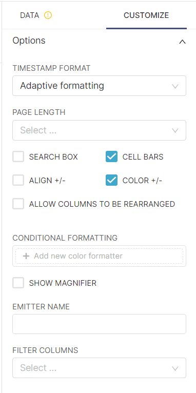
Now under the CUSTOMIZE tab we can see the 03 new options we gave. Note that when you make a change webpack will build the changes and make them automatically available.
You can try selecting a dataset and check the FILTER COLUMNS dropdown, it will pick all the available column names.
None of these really do anything so let’s go and add the code logic!
First let’s add a magnifier icon from an icon library of your choice (I will use antd). Run this command from inside (superset\superset-frontend\plugins\plugin-chart-table-customized )
npm i -S @ant-design/iconsIn the DataTable.tsx file (inside the DataTable directory) let’s import the icon, and define the following props and use them to show a magnifying icon in each row as the first column so the user can click on it and invoke a function in the TableChart.tsx:
// import the icon
import { SearchOutlined } from '@ant-design/icons';
// ...existing code ...

export interface DataTableProps<D extends object> extends TableOptions<D> {
// ...existing code ...
onExploreClick?: (
	   e: React.MouseEvent<HTMLSpanElement, MouseEvent>,
	   row: Row<D>,
	 ) => void;
	 showMagnifier?: boolean;
}

// ...existing code ...
const renderTable = () => (
<table {...getTableProps({ className: tableClassName })}>
      <thead>
        {/* ...existing code ... */}
          return (
            <tr key={headerGroupKey || headerGroup.id} {...headerGroupProps}>
							{/* Add this line */}
              {showMagnifier && <th className="explore-column"> </th>}
              {/* ...existing code ... */}
            </tr>
          );
        })}
      </thead>
      <tbody {...getTableBodyProps()}>
        {/* ...existing code ... */}
            return (
              <tr key={rowKey || row.id} {...rowProps}>
								{/* Add this snippet */}
                {showMagnifier && (
                  <td className="explore-column">
                    <SearchOutlined
                      onClick={e => onExploreClick?.(e, row)}
                      rev={undefined}
                    />
                  </td>
                )}

	{/* ...existing code ... */}

)
In the above code I have added a bit of styling as well so it looks nicer. You can style as you want and you can use the Styles.tsx file to define the styles;
.explore-column {
    width: 10%;
}
Then inside the TableChart.tsx let’s add the onClick function to the icon and pass the required props. Inside the onClick function I have used window.top.postMessage to pass the values I need to my parent React app where the superset is embedded inside.
export default function TableChart<D extends DataRecord = DataRecord>(
  props: TableChartTransformedProps<D> & {
    sticky?: DataTableProps<D>['sticky'];
  },
) {
  const {
    // ...existing code ...
    filterByCols,
    showMagnifier,
    emitterName,
  } = props;

const handleIconClick = (e: any, row: Row<D>) => {
    e.stopPropagation();
    if (filterByCols) {
      const values = filterByCols.map(col => row.original[col]);
      const message = {
        emitterName,
        values,
        filteredBy: filterByCols,
      };
      if (window.top) {
        window.top.postMessage(message, '*');
      }
			// Add an alert or a log to see what we are emitting to the parent
			alert(JSON.stringify(message));
    }
  };

return (
    <Styles>
      <DataTable<D>
        // ...existing code ...
        sticky={sticky}
        showMagnifier={showMagnifier}
        onExploreClick={onExploreClick}
      />
    </Styles>
  );
That’s all (for the second time)! Now save the files and the webpack should compile and then you should be able to see the new changes.
Doing the final touches in the Superset Frontend UI
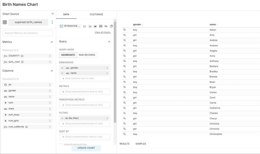
Create a new chart, select our plugin, add the necessary columns, then tick the SHOW MAGNIFIER option. You can give the chart name inside the EMITTER NAME field so you can identify from which chart the values are being emitted from if you have multiple charts in the same dashboard. Then in the FILTER COLUMNS you can select the columns of the values you need.
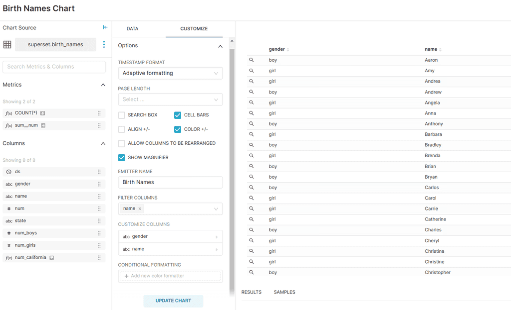
Now try adding it to a Dashboard and clicking on a magnifying (search) icon in a row to see the values of the selected row.

That’s it for customizing the plugin. Alright sorry but there IS more (for the last time). If you are interested to know how I managed to make drill down charts for my react app, I will explain the basic idea behind it so you can implement it too.
Parent (eg: React) App Approach in Brief
In the React Project inside the file where I am embedding the superset iframe, I added a useEffect to listen to the values being emitted from Superset as follows;
useEffect(() => {
    const handleMessage = (event) => {
      const message = event.data;
      console.log("parent message", message)
      // You can do the needful with the message object now, such as storing inside a useState.
      console.log(message.emitterName, message.values);

    window.addEventListener('message', handleMessage);

    return () => {
      window.removeEventListener('message', handleMessage);
    };
  }
}, [count]);
Then inside the same useEffect I am opening a Modal component when the user clicks on a magnifier icon and I am using a dynamic url for another dashboard where the drilled down chart is going to be (For this I needed to make another chart with the customized plugin) and with the help of jinja templating inside my custom dataset (eg:)
{{url_param}}I simply updated the url_params in the dashboard url.
Thats all folks! (yes, our signature ending - FINALLY!) If you want more insights, have questions or need help on data analytics or Apache superset support do reach out to us here and we can have a conversation.
